

How do you improve the mobile experience on a Shopify store?
Improve the mobile experience by making pages load fast, keeping the same content on mobile as on desktop, using large and well-spaced tap targets, simplifying navigation and forms, and offering quick checkout options such as accelerated checkout buttons. Then test on real phones and measure the results with Core Web Vitals instead of guessing. A responsive theme is the starting point, not the finish line, because apps, large images and cluttered layouts can still make a store frustrating on a small screen.
This guide gives you a practical checklist you can work through in order. It covers speed targets, search and content parity, product pages, navigation, forms and checkout, and how to test changes. At PROSeCommerce, part of PROS Global Inc in San Diego, we build and tune Shopify stores, and the checklist reflects the problems we see most often on mobile. Standards and platform details were checked against official sources as of November 2026.
Why the mobile experience matters for sales and search
Two things make mobile worth your time. The first is search. Google’s documentation says it uses the mobile version of a site’s content, crawled with the smartphone agent, for indexing and ranking, which it calls mobile-first indexing. If your mobile pages show less than your desktop pages, Google may see less of your store than you think.
The second is the shopper. A customer on a phone has a smaller screen, a slower connection some of the time, and a thumb instead of a mouse. Anything that needs pinching, zooming, precise tapping or long waiting loses people before they reach the cart. You do not need a market statistic to act on this: open your own analytics, split by device type, and compare conversion rate, bounce rate and checkout completion for mobile and desktop. A large gap is your to-do list. For a wider method, see our guide to finding the leaks in your Shopify conversion funnel.

Measure first: Core Web Vitals on mobile
Before changing anything, record a baseline. Google’s web.dev guidance on Core Web Vitals sets these targets for a good user experience:
| Metric | What it measures | Good threshold |
|---|---|---|
| Largest Contentful Paint (LCP) | Loading speed of the main content | Within 2.5 seconds of when the page starts loading |
| Interaction to Next Paint (INP) | How quickly the page responds to taps and clicks | 200 milliseconds or less |
| Cumulative Layout Shift (CLS) | Visual stability while the page loads | 0.1 or less |
Google recommends measuring at the 75th percentile of page loads, segmented across mobile and desktop, and treats a page as passing when it meets the targets for all three metrics at that level. Check your homepage, a collection page, a product page and your cart on mobile, because each one can fail for a different reason. Keep a simple log of the date, the page and the three scores so you can see whether each change helped.
Speed: fix what slows mobile pages
Most slow Shopify pages come from the same few causes.
- Heavy images. Upload images at the size you display, in a modern format, and do not use a huge banner for a small screen. Keep the first image on the page loading normally, and let images further down load as the shopper scrolls.
- Too many apps. Each app can add scripts that run on every page. List your installed apps, remove those you no longer use and ask why each remaining one needs to load on the storefront.
- Pop-ups and widgets. Chat bubbles, discount pop-ups and review carousels all compete for the same limited mobile resources. Delay or remove the ones that do not earn their place.
- Layout shifts. Set image dimensions, reserve space for banners and avoid inserting content above what the shopper is already reading. This helps keep CLS under 0.1.
- Slow responses to taps. Menus, filters and add-to-cart buttons should react at once. Long scripts that block the page hurt INP.
Make one change at a time, retest and keep the change only if the numbers improve.
Keep the same content on mobile and desktop
Google’s mobile-first indexing guidance says that having the same content on the desktop and mobile versions ensures both can rank for the same keywords, and that if your mobile site has less content than your desktop site you should consider updating it. On Shopify, this usually means checking that you are not hiding useful product descriptions, specifications, reviews or FAQs behind features that only work on desktop. Collapsing content into tabs or accordions to save space is generally fine for users, as long as the content is still present on the mobile page.
Also check titles, descriptions, structured data and images on the mobile version, and avoid blocking mobile crawlers from resources they need to render the page.
Navigation that works with a thumb
- Keep the main menu short, with the categories most shoppers need first.
- Make the search bar easy to find, because searching is often quicker than working through menus on a small screen.
- Use clear labels instead of clever ones.
- Keep the cart icon visible and the cart count accurate.
- Make filters easy to open and close, and show how many results remain.
Test by handing your phone to someone who has never used your store and asking them to find a specific product. Watch where they hesitate.
Tap targets and readable text
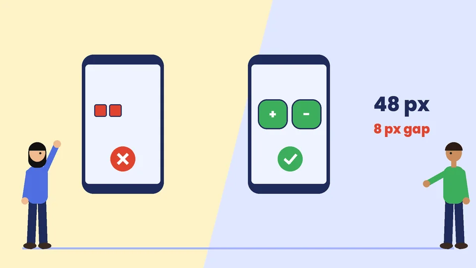
Small buttons are one of the most common mobile frustrations. Google’s accessible tap targets guidance recommends a minimum touch target size of around 48 device independent pixels, and says touch targets should be spaced about 8 pixels apart horizontally and vertically so a finger does not hit the wrong element. An icon that is only 24 pixels wide can be brought up to size with padding.
Apply that to your size selectors, quantity buttons, close icons on pop-ups, filter options and links in the footer. Then check that body text can be read without zooming and that contrast is strong enough for outdoor light.
Product pages that convert on a small screen
The product page is where mobile shoppers decide. Put the essentials in a sensible order:
- The product name and a clear image gallery that swipes smoothly.
- Price, variant choice and the add-to-cart button, visible without a long scroll.
- Delivery and returns information in a short, scannable block.
- A concise description with the key details first, followed by longer specifications.
- Reviews and social proof placed where they support the decision. See our guide on using customer reviews and social proof to build trust.
- Related products or bundles after the main decision, as covered in how to upsell on Shopify.
Keep videos from playing automatically with sound and avoid layouts that push the add-to-cart button below several screens of text.
Forms and checkout on mobile
Typing on a phone is slow, so every extra field costs you orders. Ask only for what you need, use field types that open the right keyboard, allow autofill and show clear error messages next to the field that needs fixing.
Offer quick payment options. The Shopify Help Center says that if you use Shopify Payments you can activate Shop Pay so customers can save their shipping and payment information, and that providers such as PayPal, Amazon Pay, Apple Pay and Google Pay offer accelerated checkout buttons that you can activate on your Shopify store. For more on how payments are set up, see Shopify Payments, fees and payouts. Always place a test order on a real phone, on mobile data, before you announce a change.
How to test on real devices
Browser tools that shrink a window are useful for a first look, but they do not behave like a phone. Test on at least one recent iPhone, one Android phone and one older, slower device if you can borrow one. Work through the same short script on each:
- Open the homepage from a search result or an ad link, as a real visitor would.
- Find a product with the menu and again with search.
- Change a variant, add the product to the cart and open the cart.
- Start checkout, fill the form and use an accelerated checkout button if you offer one.
- Rotate the phone and check that nothing breaks.
- Repeat on mobile data instead of Wi-Fi.
Write down every moment of hesitation or frustration, then fix the problems that appear on the path to payment first. Cosmetic issues on the About page can wait.
A simple 30-day mobile improvement plan
| Week | Focus | Tasks |
|---|---|---|
| 1 | Baseline | Record Core Web Vitals and mobile versus desktop conversion for four key pages |
| 2 | Speed | Compress images, remove unused apps, delay non-essential widgets |
| 3 | Usability | Fix tap targets, menu, search and product page order |
| 4 | Checkout | Shorten forms, enable accelerated checkout, run test orders and compare results |
Do not change everything at once. If conversion falls after a change, you want to know which change caused it.
Common mobile mistakes on Shopify
- Judging the store only on a desktop browser or by shrinking the window.
- Installing apps for small features without checking what they add to page weight.
- Hiding content on mobile that exists on desktop.
- Using tiny close buttons on pop-ups, which frustrates shoppers and can block checkout.
- Testing on one fast phone and one fast connection.
- Optimizing the homepage while the product and cart pages stay slow.
Frequently asked questions
How do I check if my Shopify store is mobile friendly?
What is a good page speed for a mobile Shopify store?
Does a responsive Shopify theme mean my store is optimized for mobile?
Why does Google care about the mobile version of my store?
How big should buttons be on a mobile store?
Should I offer accelerated checkout on mobile?
Make every tap count
A good mobile experience is the sum of many small fixes: faster pages, matching content, bigger tap targets, simpler forms and quicker payment. Measure first, change one thing at a time and test on real phones. If you would like help auditing or rebuilding your mobile storefront, contact PROSeCommerce.