

What a good user experience means
A good user experience (UX) means people can find what they came for, understand it and finish what they started on your website without friction or confusion. For an online store, that covers everything from the first page a shopper lands on to the checkout, the confirmation email and the return process.
The term is broader than how a site looks. Don Norman and Jakob Nielsen of the Nielsen Norman Group define user experience as all aspects of the end user’s interaction with a company, its services and its products. They separate it from the user interface, which is the screens and controls, and from usability, which is how easy those screens are to learn and use. A site can have a polished interface and still give a poor experience if the products, information or service behind it let people down.
This refresh of our earlier post replaces unsourced statistics with figures you can check, drawn from Baymard Institute, Google’s web.dev, Google Search Central, the W3C and the US Department of Justice, all checked as of October 2026. PROSeCommerce, part of PROS Global in San Diego, designs and improves Shopify stores for US brands, so the examples focus on ecommerce.
Why UX matters for an online store
When a store is hard to use, the cost shows up in abandoned carts, support emails, returns and customers who never come back. When it is easy to use, the same traffic produces more orders.
Baymard Institute keeps a running list of cart abandonment studies. Its list, last updated September 22, 2025, averages 50 studies to a documented cart abandonment rate of 70.22 percent. Much of that is normal browsing, but Baymard’s own research shows a large share is fixable. In its survey of US online shoppers, after setting aside people who were just browsing:
- 40 percent abandoned because extra costs such as shipping, tax and fees were too high.
- 19 percent did not trust the site with their card details.
- 18 percent left because the site wanted them to create an account.
- 17 percent found the checkout too long or complicated.
- 17 percent said the website had errors or crashed.
- 12 percent could not see or calculate the total order cost up front.
Almost every item on that list is a user experience problem. Most can be fixed with clearer information, simpler flows and better testing.
The advantages of a good user experience

More completed orders
The most direct benefit is conversion. Baymard reports that the average US checkout it benchmarks shows 23.48 form elements by default, while its usability testing found an ideal flow can be as short as 12 to 14. Fewer fields, clearer labels and fewer surprises mean more people reach the confirmation page.
Lower costs per customer
If more visitors buy, every marketing dollar goes further. The same ad budget, email list and search traffic bring in more revenue when the store does not lose people along the way.
Fewer support requests and returns
Clear product information, accurate size guides, visible delivery times and an easy order lookup answer questions before customers have to ask them. Products that match their descriptions are returned less often.
More trust and repeat business
People come back to stores that were easy to buy from. Clear policies, honest pricing and a checkout that works the first time build the trust that turns a first order into a second.
Better support for search
Google does not rank pages on design alone, but its guide to page experience says Google’s core ranking systems look to reward content that provides a good page experience. The questions it asks include whether your pages have good Core Web Vitals and whether they avoid intrusive interstitials that cover the main content. A store that loads quickly and is easy to use also gives people more reason to stay, read and buy.
Access for more customers
An accessible site works for more people, including customers who use screen readers, keyboard navigation or zoom. That widens your market and reduces legal risk, as covered below.
The building blocks of good UX
Clear navigation and search
Shoppers should be able to reach any main category in one or two clicks from the menu, and the site search should handle common misspellings and product names. Group products the way customers think about them, not the way your warehouse labels them. Our guide to Shopify themes explains how theme choice affects navigation options.
Fast, stable pages
Google’s web.dev guide to Core Web Vitals sets three targets for a good experience, measured at the 75th percentile of page loads:
- Largest Contentful Paint (LCP): 2.5 seconds or less, for loading.
- Interaction to Next Paint (INP): 200 milliseconds or less, for responsiveness.
- Cumulative Layout Shift (CLS): 0.1 or less, for visual stability.
Large uncompressed images, too many apps and heavy scripts are the usual causes of poor scores on Shopify stores. Our playbook for speeding up your Shopify store covers the fixes in order.
Product pages that answer questions
A good product page shows clear photos from several angles, the price, the variants, stock status, shipping cost or threshold, delivery time and the return policy, without making people hunt. Specifications, sizing and care details belong on the page, not only in a FAQ elsewhere.
A short, honest checkout
Show the full cost, including shipping and tax, as early as you can. Offer guest checkout, the payment methods your customers expect and clear error messages that say what to fix. Baymard’s numbers on extra costs and forced account creation show why each of these matters.
Mobile-first design
Many shoppers arrive on a phone, often from social media or email. Design tap targets large enough for a thumb, keep key buttons within reach and test every template on real devices, not only in a desktop browser.
Consistent brand experience
Colors, fonts, tone of voice and imagery should match across the site, emails and packaging. Consistency helps people recognize you and trust that they are still in the right place.
Accessibility is part of user experience
The US Department of Justice’s guidance on web accessibility and the ADA says businesses open to the public must make sure the goods and services they offer online are accessible to people with disabilities, and points to the Web Content Accessibility Guidelines (WCAG) as helpful technical standards. The guidance lists common barriers, including poor color contrast, using color alone to convey information, missing alt text, videos without captions, inaccessible forms and mouse-only navigation.
For text contrast, the W3C’s WCAG 2.2 contrast guidance for Level AA asks for a ratio of at least 4.5:1 for normal text and 3:1 for large text, which it describes as 18 point, or 14 point bold.
A practical starting checklist:
- Check text and button contrast against those ratios.
- Write short, descriptive alt text for product and content images.
- Label every form field and explain errors in words, not only with red outlines.
- Make sure every menu, filter and button works with a keyboard.
- Caption product and how-to videos.
- Let people zoom without the layout breaking.
Automated checkers help, but the DOJ guidance notes that a clean report does not mean a site is fully accessible, so pair them with manual testing. This is general guidance, not legal advice.
How to measure user experience
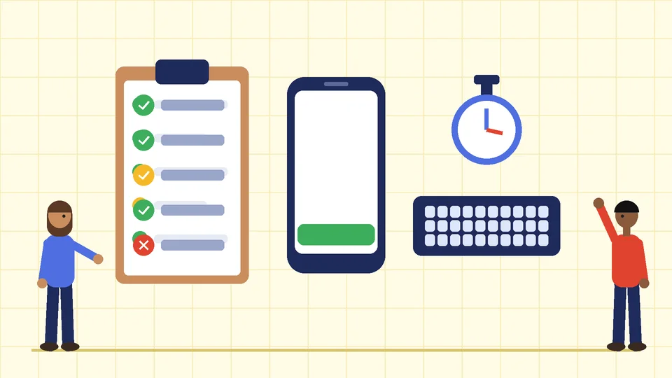
You cannot improve what you do not measure. Useful signals for an online store include:
- Conversion rate by device and page type, to see where people drop off.
- Checkout funnel steps, from cart to shipping to payment to confirmation.
- Core Web Vitals from field data, such as the Core Web Vitals report in Google Search Console.
- Site search terms with no results, which show what people want but cannot find.
- Support tickets and return reasons, grouped by theme.
- Session recordings and usability tests with a handful of real customers, which often reveal problems analytics cannot explain.
Our guide to Shopify conversion rate optimization explains how to turn those signals into a testing plan.
A quick UX audit you can run this week
- Buy a product on your own store using a phone, as a guest, with a real card. Note every moment of doubt.
- Search for five of your best sellers using the words customers use, including a typo.
- Check that shipping costs and delivery times are visible before checkout.
- Run your homepage, a collection page and a product page through PageSpeed Insights and note the Core Web Vitals.
- Tab through the main menu and checkout with only a keyboard.
- Read your last 50 support emails and list the questions the site should have answered.
- Fix the three problems that affect the most customers first, then repeat the audit next month.
If you are planning bigger changes, our guide to how to customize Shopify explains what you can change in the theme editor and what needs code.
Frequently asked questions
What is the main advantage of good user experience?
What is the difference between UX and UI?
How does user experience affect SEO?
What are the Core Web Vitals targets?
Why do shoppers abandon their carts?
Is website accessibility required for online stores?
Improve your store’s user experience
Good UX is not a one-time redesign. It is a habit of watching how customers use your store and removing what gets in their way. If you want an outside review of your Shopify store’s navigation, speed, product pages, checkout or accessibility, contact PROSeCommerce to plan the next round of improvements.